Citrix Platform Redesign
Redesigning enterprise navigation is notoriously tricky, but at Citrix, it was a critical business need. We were rapidly acquiring new products, and the old navigation could not scale with our legacy architecture, leaving users lost in a fragmented system with confusing hierarchies. We presented Citrix as a unified platform to seamlessly integrate new products and give admins a frictionless, unified experience. Watch released video
Problem
In the legacy version of Citrix Cloud console, customers (400,00 IT admins) and internal users frequently reported being confused about whether they were on an organization-level or project-level page. To solve this hierarchy problem, we completely overhauled the information architecture (IA) and navigation. We also redesigned the landing page, resolving immediate wayfinding issues while creating a scalable framework for future product rollouts.
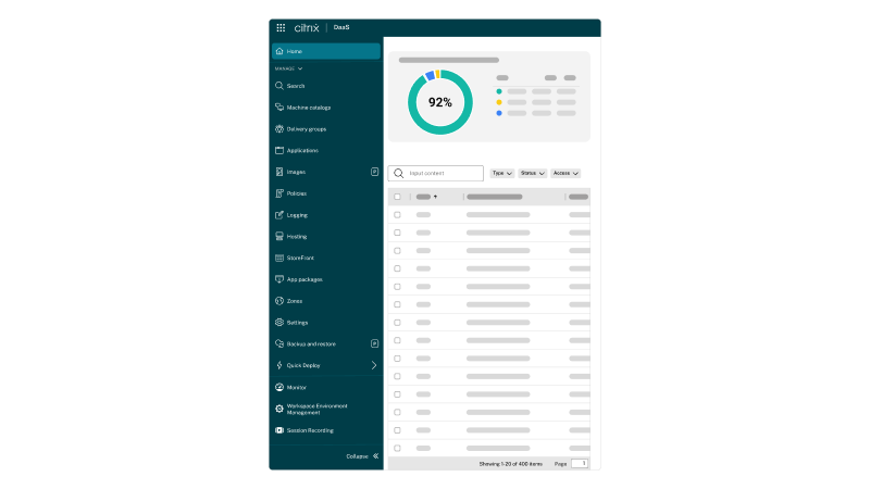
Landing page
I revamped the platform landing page to put operational utility right on the home screen. Admins now get quick access to primary tools at the top, plus a ‘Recent Activity’ feed front and center so they can see exactly what’s happening in their environment the second they log in.
Redesign of our platform landing page
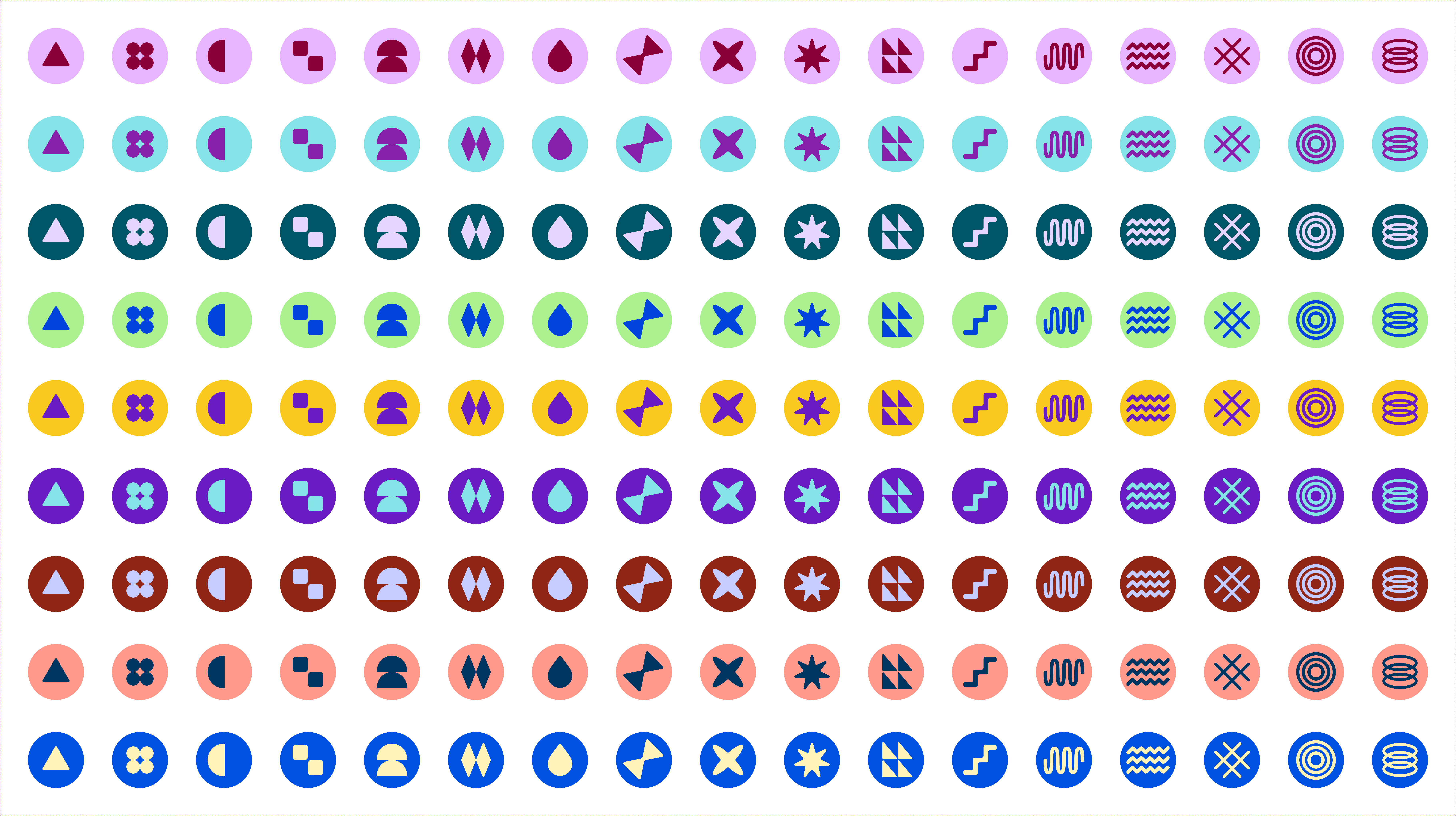
Profile icons
During the revamp, I took the opportunity to design custom profile icons for admins. While primarily a playful element to add personality, it also serves as a lightweight visual identity marker. Each admin is randomly assigned a transient icon from a curated set, bringing a touch of delight to the enterprise interface.
I
Global navigation
I redesigned the global navigation waffle menu to make the entire Citrix ecosystem accessible from any page. This new architecture directly tackles our wayfinding and scalability issues, creating a cleaner interface that drastically cuts down the clicks required for admins to complete their daily tasks.
Global navigation a.k.a waffle menu
Product navigation
The new console unifies the design across every service in the Citrix platform. Iterating rapidly based on continuous stakeholder feedback and tight four-month timelines, I prototyped the primary and secondary navigation to fix previous UX inconsistencies, such as misaligned sidebar layouts and buried configuration settings. The result is a singular design language that drastically reducing cognitive load whether an admin is managing one service or ten.
Primary product navigation
Secondary navigation
Frequently used
40% of our admins told us they have 'favorite' pages they visit daily. I designed a pinning solution so they can keep those items just one click away.
Pinning menu items in navigation
Maximize viewport
I also added the ability to hide the sidebar entirely. This allowed admins to maximize their viewport possible for monitoring data-heavy screens.
Hiding and showing the navigation sidebar
Navigation paths
I added clear navigation paths (breadcrumbs). Now, admins always know exactly where they are in the hierarchy and can hop back to a previous level instantly.
Hiding and showing the navigation sidebar
Onboarding GIFs
I designed a series of onboarding GIFs to help admins get familiar with the new layout and shortcuts instantly. These are a couple of GIFs.
GIF for accessing the waffle menu
GIF for hiding and showing the navigation
Thoughts
Leading the design for this overhaul meant collaborating closely with Engineering, Product, and Marketing to align our vision. We executed the entire redesign in just four months, a milestone made possible only by the tireless effort, thoughtfulness, and imagination of this cross-functional team. We increased the NPS by 13 points.